Monday 1 April 2013
Sunday 31 March 2013
How effective is the combination of your main product and ancillary texts?
In order for a film to
become successful a lot rests on proper marketing of said film as it is not
just a film anymore it is a media package. It is not just the trailer that
makes someone want to watch a film; it’s the posters and reviews as well. If a
poster is not effective then it won’t grab the audience’s attention so I tried
hard to relate my poster to my film, as well as my review to my film. Film
reviews also play a key part in the marketing of films; if a film gets a bad
review then it will become less likely to become as successful as one with a
good review.

In order for films to spark the audience’s interest early on
teaser posters are released, this is what I did with my short film poster. My
poster feature a photo Barbie following her drug overdose, it featured very few
details only the name of the film, the tagline, release date. Although in lower
case, smaller to the eye, are the name of my production companies and the names
of those starring in my short. The combination of both my short film and poster
works well together in my opinion, both represent Barbie in a different light
one that no one expects. In order to create an effective poster I researched
heavily into different types of posters and deconstructed them. I mainly
concentrated on minimalist posters, as that is the type I wanted to produce for
my own. One of the posters I looked at was the Star Wars teaser poster, now
this was a rather simplistic poster but it told a lot about the story without
doing much, the shadow that Anakin casts on the house in the background is that
of his future self. This was very effective and I wanted to portray something
like this in my film poster. But instead I went down a different path, one that
would better represent my film as a whole. By incorporating an image of Barbie,
a close up image of her face, it shows her vacant stare. I felt this was
important for my poster to show this as even though it is impossible to change
it is key for my short as it represents the whole storyline. In hindsight I think a different image may have been more effective instead of the one I have chosen as this image may have given too much away in the plot or confused the audience.

As important as a
poster is to the proper marketing of a film a review is as important or even
more so as a review can make or break a film. There are many different mediums
in which reviews of films can be made, even a tweet or status update can be
classed a film review in this day and age. If a film were to receive a bad
review then the likelihood of it becoming successful takes a massive dip. When
creating my film review I believed it to be important to style my writing
around that of other reviews to make it more realistic. After lots of research
into different film magazines I styled my writing style on different
journalists and how they review a film. I felt it was important to have a
common theme running through both of my ancillary tasks and my film, the
constant Barbie pink colour scheme I felt to be important as it kept bringing
the audience back to the main aspect of my short. I feel that my poster and
film review work well together and are in keeping with the genre and design of
my film and complement each other in numerous different ways.

In what ways does your media product use, develop or challenge forms and conventions of real media products?
There are many
conventions of short films which I both used and developed upon. One convention
of short films is that they have very few characters, as it would be impossible
to adequately introduce lots of different characters into a film which is so short;
this is something I implemented in my short. I have very few characters in my film;
only the title character, Barbie, and Ken have a back story as it would be
impossible to go into detail about every character’s life history, as that
would turn a short into a longer film breaking another convention. The length
of a short film is probably one of the most important conventions as in order
for a film to be classed as a short it needs to be between 3-30 minutes long.
My film does conform to this convention as it is only just under 4 minutes
long.


Another convention of
a short film is that this is a twist in the story; my whole film is full of
storyline twists. In order to keep the audience laughing my storyline keeps
them guessing adding shock value. It is not the typical Barbie and Ken story,
the whole thing is a twist – the atypical Barbie story flipped on its head. The
story is the opposite of what you’d expect, just what a successful short film
aims to do.
I wanted to emulate a
comedy style mockumentary, in order to understand the conventions of this genre
I researched it thoroughly. By looking at other films in the mockumentary
genre, one in particular being from the creators of “Funny or Die” videos. Many
of these videos are mockumentaries or comedy shorts, taking ordinary situations
and flipping them on their hear making them unexpected and amusing just like
how I wanted my film to come across. One short film in particular I looked at
was “Home For Actresses” this is a short documenting a home where actresses go
to learn their craft, it is a documentary style short but it is comedic.
As my short is a stop
motion film I challenged one of the conventions of this genre by incorporating
an element of live action within the stop motion. Most of my film is stop
motion however, I made it a film within a film adding the conversation with the
Real Life Barbie, this does not conform to other stop motion or mockumentary
short films.


Wednesday 27 February 2013
Final Film
Feedback to my final film
Awesome!
Really good! I love the animation with the dolls!
Love the film!!
It is really good! Love the pictures of Steph at the end in particular! Very creative :)
That was cool! :L I hate Cindy! Poor Barbie! Well done! :) Ver gut ver gut!
I like it, it's really funny. Sometime I did think Lawrence's voice was a bit monotone and like maybe you could edit the speech a little so he wasn't just like "and then this happened and then this happened" and Steph's bit might be just a little long. It was really good though!
I really liked the use of stop motion - the mix between photographs and footage, real talk and narration creates a mix which works really nicely. Well done, it was very funny :)
Unique idea - I love how you have adapted the story of Barbie and related it to real life. It makes you question what it does for the media and how girls might react through the influence of toys like that. The background works really well (behind Barbie and Ken) and when she's talking about the Barbie.
Really good use of stop motion and an original idea. Maybe a little short and ending felt a bit sudden, could have maybe expanded the ending. Well done though, thought it was very effective.
I really like what you've added, with the drug bits etc, it makes it funny. But at the end where you see that the girl has also turned to that it changes the type of comedy - getting the audience to laugh but then shocking them. I think perhaps the part of her talking is a bit repetitive though - and almost turns it more into a documentary that is doesn't seem like through the rest of the film.
Very good, music is fitting, gives it a serious tone. The drugs part is very comical :) like the use of Barbie titling. Only criticism is the two ending images are a bit quick. Well done!
Tuesday 26 February 2013


Wednesday 6 February 2013
Designing my own Magazine Review
Upon looking at a number of different magazine film reviews and deconstructing them, I have started to design my own. I have decided to do this in Adobe Photoshop as this is the program I feel most comfortable using. Below is a basic outline of what my review might look like, I have just chosen a random photo of the main actress, Steph, and haven't decided which shot to use yet. I have done an outline of the basic layout, I have yet to add the actual review into the shot as I am writing that in Word then transferring it over when I have decided upon the final layout. I am also going to add another photo but of the Barbie doll herself, I have yet to decide whether it will be a photo of her as the stereotypical Barbie or as she is at the end of the film as I do not want to give too much of the plot away in the images.

I have however, added some key facts about my short film in the top left such as the running time and who's starring in the film.
I started to play around with some other photos that I could add to the interview without giving too much of the plot away, I also started to add some of the actual review into the layout as well to see how much text I'd actually need to fill up the double page spread. I thought about adding the photo of Ken proposing to a pregnant Barbie. This does not give the twist ending of the plot away but it does show a interesting turn in events.
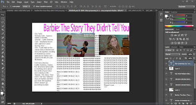
After messing around in Photoshop for a while trying to decide upon my layout for my review without writing all of it I then change it completely following actually writing my review. I wrote so much that I decided that I would in fact only have one image, one of Steph looking confused holding the two dolls. This is the final design that I decided upon.

As you can see I decided upon having a pink colour scheme to match the one of the film, with the original title and font across with the top.
Tuesday 5 February 2013
Magazine Review Research
In order to design a realistic film review from a magazine I have been researching the design of the typical film review. There are many different film magazines which, one a weekly basis, review the latest films one of which being one of the most popular in the UK, "Empire".
Some of the better films have more space in the magazine and get a more in depth review, this can be seen below with the review of the 2010 film "Love and Other Drugs" starring Anne Hathaway and Jake Gyllenhaal.

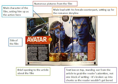
Many Blockbuster films get a two page, or even more, spread in film magazines to spike the reader's interest. This can be seen in "Avatar" below.
Some of the better films have more space in the magazine and get a more in depth review, this can be seen below with the review of the 2010 film "Love and Other Drugs" starring Anne Hathaway and Jake Gyllenhaal.

As seen above, the title of the film is in bold standing out to the reader, it also has some key facts about the film down the side in case the reader doesn't want to read the whole article to see what the film is about or to spike their interest.
Many Blockbuster films get a two page, or even more, spread in film magazines to spike the reader's interest. This can be seen in "Avatar" below.
Monday 4 February 2013
Poster Research
I have had many different ideas what to do for my final film poster, I have begun researching different types of posters to see which one would best suit my film. I really like the idea of minimalist film posters, as the name suggests they don't have much on them and don't give much away, however, if the film is iconic enough even without the title you can tell what the film is.

I have also been looking at teaser posters, these again don't give too much away in the poster, often they are only a single image with only the title of the film


I have also been looking at teaser posters, these again don't give too much away in the poster, often they are only a single image with only the title of the film


Final Poster Idea
I have designed several different film posters for my short film, I have felt none of them have really worked. The one I liked the best was the mug shot poster, but then it doesn't really apply to my film as Barbie never gets arrested. I then had the idea of have a photo of Real Life Barbie passed out on a park bench with a bottle of Jack Daniels in her hand and having that as my film poster. But due to time constraints and the fact my Real Life Barbie has a full time job I have not been able to take this photo. I then had a further idea of a crime scene photo as my poster, just the outline of a body in chalk on the ground where Barbie died of a drug overdose. This then adds to the title of the film as it adds to the conspiracy around the fact that this story was untold... until now.

Tuesday 29 January 2013
Audience Feedback to Rough Cut
These are the audience feedbacks to my rough cut of my short film when i showed it to my class, also from some of my friends as well.
Level - 2, Mark - 22
I liked the stop motion bit at the beginning. I didn't really get the girl at the end though, or what she was trying to put across
Level - 2, Mark - 23
Isn't the music copyrighted? I think you could get better narration. Some of the arm movements in the stop motion animation seems pointless. You could have music in the background of the narration? Would a teenage girl care about Barbie? Is she deluded?? You could of had more camera shots.
Level - 3, Mark - 29
Original idea! The backgrounds work really well and so does the concept. The title suits the theme perfectly and is really well made
Level - 4, Mark - 32 (more when finished)
LOVE the song, narration! Stop motion is grrrrrrreat! CAN NOT WAIT TO SEE the cocaine bit. Steph is so funny! So so so so good. Snaggle arm adds to the realism!
Level - 3, Mark - 27
Stop motion work well and was a perfect mix of funny and sad. Overall I really enjoyed it!
Level - 2/3, Mark - 23/24
I like the mix of footage and stop motion. Very funny story. I think the real life Barbie needs more development. Stop motion is good
Level - 3, Mark - 30
Effective stop motion. I like the narration. Funny footage.
Level - 3
Good use of stop motion, very impressive. Narration goes well. Steph - very good Barbie impression. Very clever concept - looking forward to seeing end of it.
Level - 3, Mark - 31
Such a creative idea! Very original! You've obviously spent a lot of time on this - very well executed. Hilarious script
Level - 4, Mark - 34
Very funny twist on a common everyday story. Frame rate was off, which I found a tad off-putting. Stop motion was very effective. Really good!
Monday 28 January 2013
Saturday 26 January 2013
Narration for my Short Film
I decided upon narration for my short film as I didn't want to voice the Barbie and Ken dolls. As I've said before I wanted a Morgan Freeman type voice or James Earl Jones to narrate my film, but both of those actors were otherwise occupied when asked to participate. Instead I settled for my friend Lawrence to narrate, at first he tried to emulate Morgan Freeman, but that didn't go so well as he has a distinctive Norfolk twang in his voice! So instead I gave him the script and he read it normally. We did numerous takes at first trying to record it on my camera but that didn't pick up his voice too well, then we moved onto my laptop. I had recorded my voice on it before and it worked fine but when we tried to record Lawrence's it sounded muffled and we had to change our recording device once again. The third device we used was his laptop, but again it sounded muffled and almost robotic.
The fourth recording device we used was my phone, when we tested it, it sounded good. We then recorded the whole script but then when playing it back it had a strange buzz in the background! So we moved on to the FIFTH recording device!! We used Lawrence's iPod and miracle of miracles it worked!! After 3 hours, going on 4 we finally finished recording the narration for my film!
 |
| Lawrence playing with his Rubik's cube whilst I tried to sort out the technical difficulties |
Friday 25 January 2013
Barbie turns to prostitution!!
Today I ventured outside to film the final scene of my short film, when Barbie hits rock bottom and turns to prostitution for drug money. As I filmed all of my scenes inside and on a set scenary, apart from the cocaine but that was just my dining room table, it was a shock to film outside again. Brought me back to my AS days filming in the cold outside! For this scene Barbie is trying to find a "John" to give her money but is not having any luck. As seen below I used a remote control camper van to drive past Barbie while she's trying to get their attention.


Wednesday 23 January 2013
Poster Planning


This is a rough draft of my poster. It's supposed to look like she is having her mug shot taken the strung out version of Barbie post Ken cheating.
I also thought about doing a poster of half a Barbie Doll face and half Steph's face.

But the more I played around with this idea the more I decided against it, I didn't think it would look as authentic.
Subscribe to:
Posts (Atom)