I have however, added some key facts about my short film in the top left such as the running time and who's starring in the film.
I started to play around with some other photos that I could add to the interview without giving too much of the plot away, I also started to add some of the actual review into the layout as well to see how much text I'd actually need to fill up the double page spread. I thought about adding the photo of Ken proposing to a pregnant Barbie. This does not give the twist ending of the plot away but it does show a interesting turn in events.

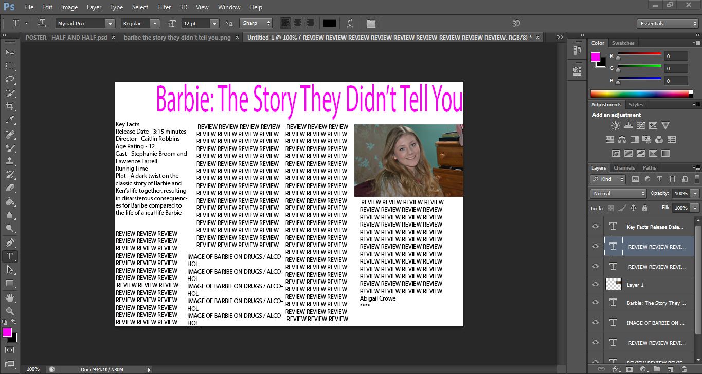
After messing around in Photoshop for a while trying to decide upon my layout for my review without writing all of it I then change it completely following actually writing my review. I wrote so much that I decided that I would in fact only have one image, one of Steph looking confused holding the two dolls. This is the final design that I decided upon.

As you can see I decided upon having a pink colour scheme to match the one of the film, with the original title and font across with the top.
No comments:
Post a Comment