Wednesday 27 February 2013

Final Film


Feedback to my final film

Awesome! 

Really good! I love the animation with the dolls!

Love the film!!

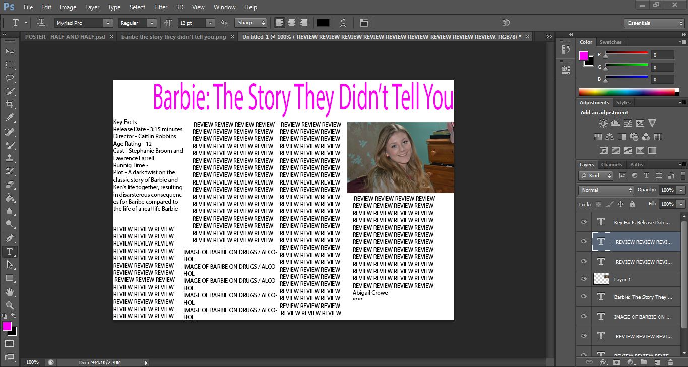
It is really good! Love the pictures of Steph at the end in particular! Very creative :)

That was cool! :L I hate Cindy! Poor Barbie! Well done! :) Ver gut ver gut!

I watched, I liked. I think it was an interesting, different way to look at the story of Ken and Barbie. It seems weird to say realistic but the story we all know about isn't realistic either. Had good editing too. I liked the part with Steph was random but I liked it!

I like it, it's really funny. Sometime I did think Lawrence's voice was a bit monotone and like maybe you could edit the speech a little so he wasn't just like "and then this happened and then this happened" and Steph's bit might be just a little long. It was really good though!

I really liked the use of stop motion - the mix between photographs and footage, real talk and narration creates a mix which works really nicely. Well done, it was very funny :)

Unique idea - I love how you have adapted the story of Barbie and related it to real life. It makes you question what it does for the media and how girls might react through the influence of toys like that. The background works really well (behind Barbie and Ken) and when she's talking about the Barbie.

Really good use of stop motion and an original idea. Maybe a little short and ending felt a bit sudden, could have maybe expanded the ending. Well done though, thought it was very effective.

I really like what you've added, with the drug bits etc, it makes it funny. But at the end where you see that the girl has also turned to that it changes the type of comedy - getting the audience to laugh but then shocking them. I think perhaps the part of her talking is a bit repetitive though - and almost turns it more into a documentary that is doesn't seem like through the rest of the film.


Very good, music is fitting, gives it a serious tone. The drugs part is very comical :) like the use of Barbie titling. Only criticism is the two ending images are a bit quick. Well done!

Wednesday 6 February 2013

Designing my own Magazine Review

Upon looking at a number of different magazine film reviews and deconstructing them, I have started to design my own. I have decided to do this in Adobe Photoshop as this is the program I feel most comfortable using. Below is a basic outline of what my review might look like, I have just chosen a random photo of the main actress, Steph, and haven't decided which shot to use yet. I have done an outline of the basic layout, I have yet to add the actual review into the shot as I am writing that in Word then transferring it over when I have decided upon the final layout. I am also going to add another photo but of the Barbie doll herself, I have yet to decide whether it will be a photo of her as the stereotypical Barbie or as she is at the end of the film as I do not want to give too much of the plot away in the images.


I have however, added some key facts about my short film in the top left such as the running time and who's starring in the film.
I started to play around with some other photos that I could add to the interview without giving too much of the plot away, I also started to add some of the actual review into the layout as well to see how much text I'd actually need to fill up the double page spread. I thought about adding the photo of Ken proposing to a pregnant Barbie. This does not give the twist ending of the plot away but it does show a interesting turn in events.


After messing around in Photoshop for a while trying to decide upon my layout for my review without writing all of it I then change it completely following actually writing my review. I wrote so much that I decided that I would in fact only have one image, one of Steph looking confused holding the two dolls. This is the final design that I decided upon.


As you can see I decided upon having a pink colour scheme to match the one of the film, with the original title and font across with the top. 

Tuesday 5 February 2013

Magazine Review Research

In order to design a realistic film review from a magazine I have been researching the design of the typical film review. There are many different film magazines which, one a weekly basis, review the latest films one of which being one of the most popular in the UK, "Empire".
Some of the better films have more space in the magazine and get a more in depth review, this can be seen below with the review of the 2010 film "Love and Other Drugs" starring Anne Hathaway and Jake Gyllenhaal.

As seen above, the title of the film is in bold standing out to the reader, it also has some key facts about the film down the side in case the reader doesn't want to read the whole article to see what the film is about or to spike their interest. 

Many Blockbuster films get a two page, or even more, spread in film magazines to spike the reader's interest. This can be seen in "Avatar" below.


Monday 4 February 2013

Poster Research

I have had many different ideas what to do for my final film poster, I have begun researching different types of posters to see which one would best suit my film. I really like the idea of minimalist film posters, as the name suggests they don't have much on them and don't give much away, however, if the film is iconic enough even without the title you can tell what the film is.


I have also been looking at teaser posters, these again don't give too much away in the poster, often they are only a single image with only the title of the film


Final Poster Idea

I have designed several different film posters for my short film, I have felt none of them have really worked. The one I liked the best was the mug shot poster, but then it doesn't really apply to my film as Barbie never gets arrested. I then had the idea of have a photo of Real Life Barbie passed out on a park bench with a bottle of Jack Daniels in her hand and having that as my film poster. But due to time constraints and the fact my Real Life Barbie has a full time job I have not been able to take this photo. I then had a further idea of a crime scene photo as my poster, just the outline of a body in chalk on the ground where Barbie died of a drug overdose. This then adds to the title of the film as it adds to the conspiracy around the fact that this story was untold... until now.